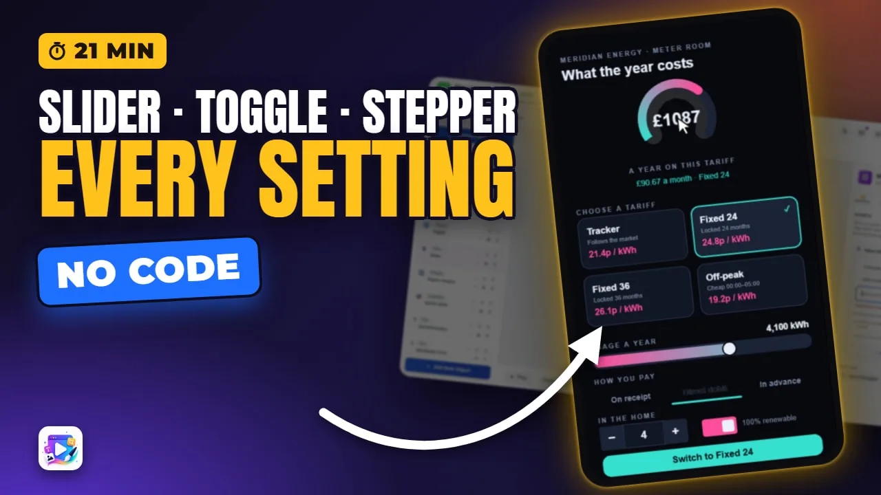
In this video
- The three controls: a Slider for an amount, a Stepper for a count, a Toggle for a yes or no
- Writes to — the first field, and the one that decides whether the control does anything at all
- Min, Max, Step and the starting value — and what Step 0 really does to a slider
- Every Stepper field on screen: layout, button shape, size, gap, radius, colours, border, dividers, custom glyphs, value align, decimals, inset, the spent-key fade, prefix and suffix
- Every Toggle field on screen: Switch, Checkbox, Segmented and Button, knob shape, On and Off colours, inset, radius, border, and the ON / OFF labels
- Every Slider field on screen: direction, the six Progress styles with their own settings, segments, colours, thresholds, track, markers, knob, shimmer, stripes and the label
- Reading values back live with {tokens}, and gating a control with Show If Variable
- Value Changed, Switched On and Switched Off — the controls’ own event triggers
- One Compute on Value Changed, so the price recalculates as the viewer moves anything
- Testing in Play, and three mistakes to avoid
About this video
Input controls are what turn a playable ad from something you watch into something you answer. A Slider sets an amount, a Stepper counts, and a Toggle says yes or no — and all three write straight into a variable, which is what the rest of the ad reads. This is the long version: every field on all three panels, changed on camera with the canvas held long enough to see what it did, and a reason you would reach for it. We build a weekend-stay quote screen from scratch, bind all three controls, set the ranges, work through Arrangement, Appearance, Text, Behaviour, Style, Colours, Embellishments and Label, then put one Compute action on each control’s own Value Changed trigger — so the price re-prices the moment anything moves, with no button to press. Every feature shown is on every plan.
Exports for Unity, AppLovin, Google, IronSource, Mintegral, Meta (Facebook), Moloco, TikTok, Liftoff, Vungle, Chartboost, InMobi and Pangle — one self-contained HTML5 file each.
Transcript
Captions in 18 languages on YouTube
Slide the usage, count the household, flick one switch — and the figure on the dial keeps up with every one of them.
That is a Slider, a Stepper and a Toggle. In the next few minutes you'll add all three, go through every field on their panels, and price the result — with no code.
Each one asks the viewer a question. A Slider for an amount, a Stepper for a count, a Toggle for a yes or no.
Read the full transcriptShow less
And each one writes its answer straight into a variable. The control doesn't own the value — the variable is the value.
So the variables come first. Nights, guests, breakfast and total are declared already — that's the Variables video, linked below.
All three are in Add New Object. I will start with the Stepper.
Every new object lands in the middle of the canvas, so they arrive on top of each other. Place each one before you add the next: X, Y, Width and Height, at the top of the panel.
Display Name is what the layers list calls it. Rename it now and you will still know which control is which, twenty layers later.
Show If Variable hides the whole control until a variable says otherwise. It stays put while you build, so you can still edit it — I will show you it disappearing in Play.
Then the field that matters most, and it is the first one: Writes to. Pick the variable this control should write.
Until you do, the panel says it plainly: nothing bound, so this control does nothing. It won't even move when dragged.
A Stepper and a Slider want a Number. A Toggle wants a Boolean — so each one only offers you the variables it can actually use.
Then Range: Min, Max, Step, and the value it starts on. Nights runs from 1 to 7, a step of 1.
Starting value is where the conversation opens. Put it on the number most people would pick rather than on the minimum — two nights already on screen is an answer they only have to adjust.
On a Stepper that range clamps rather than wraps: each tap moves by one Step and stops at the end.
On a Slider, Step matters more than it looks. Leave it at 0 and the slider slides continuously, so one drag gives you 97.16 guests.
Set the step to 1, and it snaps to whole guests. Set it on anything a person would count.
Now the Stepper's own groups, in the order the panel lists them. Arrangement first. Layout puts the buttons either side of the read-out, both after it, both before it, or stacked above and below.
Button shape joins the keys to the field, or cuts them loose as pills, circles or squares, or drops the plate and leaves the bare glyph. Circles read as buttons on a busy screen, where a joined key can look like part of the picture.
Under it: Button size, Gap and Radius. A gap is what turns one shared pill into three separate objects — and a bigger key is a bigger touch target, which is the whole game on a phone.
Appearance is colour first: the Field behind the number, the Buttons, and the Glyphs on them. Three swatches are usually all it takes to make a control look like it belongs to your brand.
Then a Border with its own width, and the Dividers between the parts — a hairline divider is how a joined stepper still shows where the key ends and the number begins.
The glyphs themselves are yours. Any character can be the minus and the plus, at whatever Glyph size you give them — arrows for a browser, chevrons for a picker.
Value align puts the number in the centre, or hard left, or hard right. Left is for a read-out with a unit after it, so the number stays still while the word moves.
Decimals is how many places it prints. Nights are whole numbers; a weight or a rate wants one or two.
Inset is the breathing room around the number. Open it up and the read-out stops touching the keys, which matters most when the value is long.
Spent key opacity is worth keeping. At the minimum the minus fades, at the maximum the plus does, so a key that can no longer do anything stops looking live — set it to one for a stepper that never admits it has stopped.
Prefix and Suffix print around the number: a currency sign in front, the word nights after. And the read-out between them is deliberately inert, so a mis-tap in the centre changes nothing.
Last group, Text: the size, colour, weight and font of the number itself. This is the one that decides whether the control reads from a metre away.
The Toggle next. Its Range is a single sentence, because a toggle is on or off: it writes true or false to a Boolean, or one and zero if you bind it to a Number.
Style is the whole look. A Switch with a knob that slides, a Checkbox that ticks, a Segmented pair of labelled halves, or a Button that stays pressed. Segmented is two answers rather than a switch — pressing a half selects it.
A Checkbox and a Segmented pair draw their words beside the box, so give the object room. The whole width stays tappable, which is what makes a checkbox easy to hit with a thumb.
Beside Style, a switch chooses a round or square knob, and every other look uses that slot for its corner radius.
Then the colours: On, Off, and the knob. Off is the one you can see while you build; On is what the viewer gets for saying yes, so make it the colour your ad uses for yes.
Inset is how deep the knob sits in the track, and Radius squares the whole thing off — a switch at radius six stops being a phone switch and starts being yours.
A border, with its own colour, for a toggle sitting on a photograph where a flat pill would disappear.
Show ON / OFF text gives you the two labels — which on a Segmented toggle become the left and right halves instead — and any words will do: Yes and No, Add and Added, Monthly and Yearly.
And the Text group styles those words: size, colour, weight and font.
And the Slider, which has the longest panel of the three, for one good reason: a Slider is a Progress bar you can grab.
Only Behaviour is its own. Start from far end fills it the other way, for a bar that drains rather than grows. Write while dragging keeps the knob exactly under your finger; turn it off and the bar eases after it instead — easier to feel than to see, so leave it on unless the bar is long and heavily styled.
Everything below that is the Progress controls. Style: Bar, Ring, Arc, Steps, Pie or Liquid — every bar style is a slider style, so a slider can be a dial.
A ring cannot live in a thirty-pixel strip, so before the round styles, give the object a square box. All six styles draw into that same box.
Ring, with its own fields: Thickness, the Start angle it begins from, and whether the ends are rounded or cut flat. A ring is the one people read as a dial.
Arc is a ring with a gap. Sweep decides how much of the circle it uses and Clockwise which way it fills — 270° is the speedometer everybody recognises.
Pie fills like a clock, and Donut hole opens the middle — which is where you put the number.
Steps turns the track into nodes: how many, their shape, their size, the connector between them, and numbering. That is a checkout, a level map, or a quiz showing how far in they are.
Liquid fills a vessel — a circle or a rounded rectangle — with a wave whose height, length and speed you set, and a second slower wave underneath, which is the thing that makes it read as liquid.
Direction stands the whole thing up. A vertical slider is a volume, a temperature, a floor in a lift. And the same Direction appears in Behaviour and in Style, because it is one setting in two places.
Back on a Bar: Segments cuts the track into pieces with a gap between them, which turns an amount into a count you can read at a glance. Snap to whole segments fills them one at a time — it changes nothing here, because a step of one already lands on a segment.
Corner radius takes it from a pill to a hard-edged bar, and Fill inset is the gap between the fill and the track — a thin fill inside a wide track is the progress look every game uses.
Colours: a solid fill, a gradient, or thresholds that change the colour as the value climbs. Then the track, its opacity, whether it is drawn at all, and a border.
Fill is the colour of the answer. Put your own accent colour in there and the slider stops looking like a default.
Gradient adds a second colour at the far end, so the bar warms up as it fills.
Thresholds change the colour at values you choose — red under 25, amber under 50, your fill colour above them. That is a health bar, a fuel gauge, a budget warning.
The track behind it takes its own colour and its own opacity, and can be turned off completely — for a fill drawn straight onto your artwork.
And a border with its own colour, which is what keeps a pale bar visible on a pale photograph.
Embellishments are the extras — milestone markers along the track, the leading knob, a shimmer sweep, and animated stripes.
Markers are ticks at values you type, in the bar’s own units. The same values are the choices for the Progress Milestone trigger, so the ad can fire something at each one.
The leading knob is the grab handle: its radius, colour and border, and a shape — round, a rounded block, a square, a grip or a diamond. Make it big. It is what a thumb is aiming at.
Shimmer sweeps a highlight along the filled span — the classic still-going cue.
Animated stripes give it barber-pole motion, with their own width, angle, speed, colour and opacity. Motion on a control is what tells a viewer it can be touched.
And Label, which is the number the viewer reads. Show label turns it on, and everything under it is how it looks.
Format prints it as a percent, a fraction, the raw value, steps, a time — or a Custom template you write yourself, with the tokens as chips you click. Two of six guests, in your own words.
Position is centred in the track by default, and that default was learned the hard way: above, it lands on whatever caption is sitting there. Above, below, either side, inside the head, or following the head — pick the one with room.
Then its offset, size, colour, decimals, font and weight, an outline and a shadow. The outline is what keeps a white number readable when the fill passes underneath it.
That is General. Every control also has Animate, FX and Events — the same entrance and loop presets, and the same filters, as any other object — and further down General, opacity, rotation, scale and blend mode, per orientation.
Now press Play and read the values back. Anywhere you can type, the name in curly brackets prints it live — the line at the top is nights and guests, moving as I move them.
The price underneath does not move, and that is not a bug: nothing has told it to. A value changing, and something happening because of it, are two different jobs.
This is also where Show If Variable shows itself. Gate the slider on breakfast, and in Play it is simply not there until the toggle says yes — which is how you ask a question only when it becomes relevant.
And a control has events of its own. Open the Events tab on any of them and there is Value Changed — it fires the moment the value really changes, and not on every pixel of a drag.
A Toggle carries two more: Switched On and Switched Off. So "when they turn it on" is a trigger, instead of a condition you have to write.
Which is exactly what a price wants. A price is a formula, a formula is an action: Value Changed → Add action → Compute → total = {nights} × 90 + {guests} × 15 + 12 for breakfast.
The panel checks the expression as you type, and tells you what it comes to with the starting values.
The same two clicks on the Stepper and the Toggle, and all three re-price the screen as they move. No button, no waiting for one.
The price itself is that one variable with a format on it — {total|money} — so it always prints 2 decimals.
Controls stay still while you build, so a drag moves the object and not the value. Press Play to use them.
Step the nights, drag the guests, flip breakfast — the line at the top and the price underneath both keep up, with nothing left to press.
And keep tapping: it stops at seven and stays there. That is the clamp — a viewer cannot book a hundred nights by leaning on the key.
Three mistakes. One: an unbound control. It looks perfect and does nothing, so check Writes to first.
Two: leaving Step at 0 on something a person counts, and shipping 97.16 guests.
Three: putting the formula where it never runs. On Value Changed it recalculates every time the viewer moves anything; on a button it waits for the button.
For a finished one, remix Energy, Meter Wall: a slider, a stepper and a toggle, all feeding one figure on a dial.
Next up: video breaks. See you in the next video!
Build your first one free, at playableadsmaker.com.