In this video
- Adding a Progress object
- Six styles: Bar, Ring, Arc, Steps, Pie, Liquid
- Fill colours, gradients and thresholds; the track
- Label formats and custom templates
- Sources: Time, Variable, Set by Events
- The Set Progress action, in the bar's own units
- Progress Milestone and Progress Complete
- Three mistakes to avoid
About this video
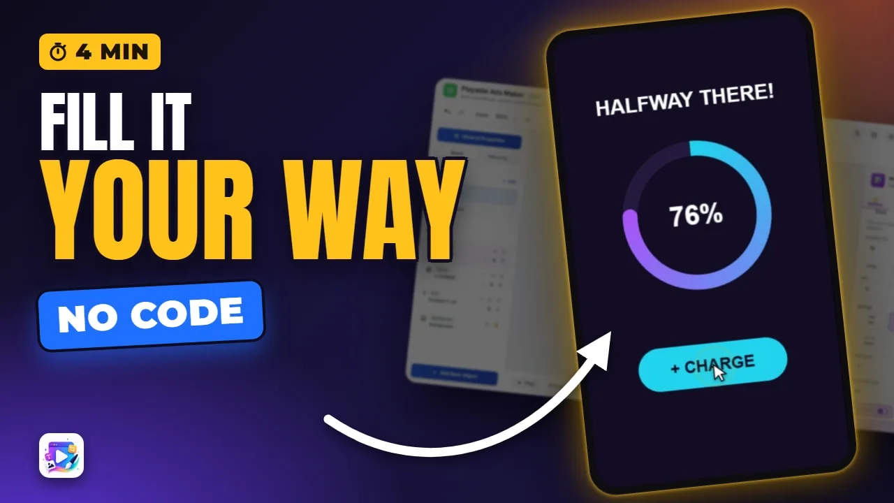
The Progress object draws a bar, ring, gauge, steps, pie or liquid fill, and its Source decides what fills it: time, a variable, or your own buttons through the Set Progress action. This tutorial builds a charge-up ring that fills twenty at a time, changes the headline at a milestone and moves to the End Card when it is complete - and covers colours, labels and the three mistakes that make a bar look broken.
Playable Ads Maker - build playable ads and end cards, export to 13 ad networks.
Transcript
Every tap charges the ring. Halfway, it tells you. And when it's full, the ad moves on by itself.
That's the progress object. In the next few minutes: all six styles, the colours and the label, what fills it, and the two triggers it fires.
Add New Object, Progress. It arrives as a bar that fills itself over ten seconds - because its Source is Time.
Read the full transcriptShow less
There are six styles. Bar. Ring. Arc, for a gauge. Steps. Pie. And Liquid.
Rings, arcs and pies are drawn from the shorter side of the box, so give them a square one. I'll keep the ring, and make it thicker.
The fill can be one colour, a gradient, or thresholds that change colour as it fills. There's the track behind it, too.
The label reads a percent by default. It can also be a fraction, a value, a step count, time left, or your own template.
Source decides what fills it. Time fills it on its own. Variable follows a number - the Follow the Path video drives one from a drag. And Set by Events is for your buttons.
Set by Events, starting at zero.
Now the button. On Tap, add Set Progress: this progress, Add, twenty. That's in its own units, zero to a hundred here - not a percent of anything else.
The ring has triggers of its own. Progress Milestone fires at a marker: at fifty, change the headline.
And Progress Complete goes to the End Card.
Press Play, and charge it.
Twenty at a time. Past halfway, the headline changes. Full - and the End Card.
Three mistakes to avoid. One: Set Progress with a Time or Variable source. That source keeps writing the value, so your action is overwritten.
Two: percent thinking. Set Progress and the markers use the bar's own Min and Max. With a max of five, add one, not twenty.
Three: a ring in a wide box. It's drawn from the shorter side, so a wide, short box gives you a tiny ring.
That's the progress object. See you in the next video!