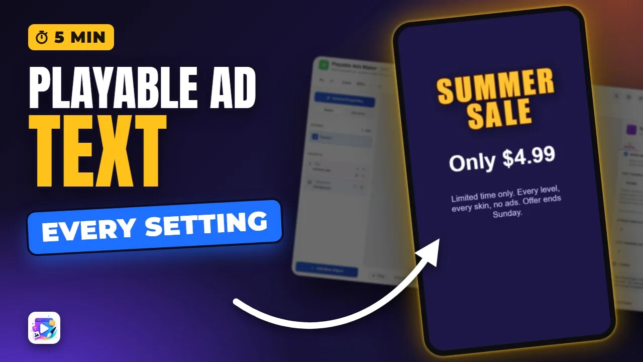
In this video
- Add a Text and set its Width first, so the words wrap where you want
- Font Family, Font Size, Font Weight, Text Color and Text Transform
- Letter Spacing, Line Height, Text Align, stroke and Drop Shadow
- Word Wrap, auto-height, and what Text Overflow: Ellipsis does
- Text that reacts: live values in {curly braces} and the Set Text action
- Landscape keeps its own font size, letter spacing and line height
- Translations in Localization, a preview per language, right-to-left Arabic
- Letter Bounce, Play, and three mistakes to avoid
About this video
Text is on nearly every screen of a playable ad: the headline that stops the scroll, the price that makes the offer, and the small print that has to stay readable on a phone. This tutorial builds an end card from a blank project and walks through every setting of the Text object in Playable Ads Maker, including the ones that bite later — a new text box that starts narrow, landscape sizes that do not follow portrait, a display font with no Japanese letters, and Arabic, which reads right to left with its letters joined. Every setting shown is on every plan, and the finished ad exports as one self-contained HTML5 file per ad network.
Exports for Unity, AppLovin, Google, IronSource, Mintegral, Meta (Facebook), Moloco, TikTok, Liftoff, Vungle, Chartboost, InMobi and Pangle.
Transcript
Captions in 18 languages on YouTube
This end card is just three text objects, and it switches to French, Japanese and Arabic. Here's every text setting that built it.
Text carries the headline, the price and the small print of almost every playable ad, and every setting here is on every plan.
I've started a blank project with a dark background. Click Add New Object, then Text.
Read the full transcriptShow less
A new text box starts narrow, so set its width first. 300, and the words wrap where you want.
Now type your headline into Text Content. The canvas updates as you type.
Choose a Font Family. Impact is bold and condensed, made for headlines.
Set the Font Size. Below 8, it snaps back to 8 when you leave the field.
For a font you upload, Font Weight only lists the weights that font really has.
Pick a Text Color. Then Text Transform makes it uppercase, and what you typed stays as it is.
Letter Spacing opens the letters up, and Line Height pulls the two lines closer together.
Text Align sets the side. In Arabic, left and right swap on their own.
For contrast, Stroke Width and Stroke Color outline every letter, and Drop Shadow is on the FX tab.
Next, the price. A second text, width first again, 44 px, bold.
A price shouldn't break onto two lines, so switch Word Wrap off. Now the box grows sideways instead.
Last, the small print. With Word Wrap on, it wraps inside its width, and the box grows taller by itself. That's auto-height.
Text Overflow decides what happens when the words don't fit. Ellipsis keeps the box and ends in three dots. Clip keeps it too, and cuts the text at the edge. Visible, the default, lets the box grow.
Text can also react while the ad runs. Put a variable in curly braces, and it shows a live value, like a score.
And on the Events tab, a Set Text action rewrites a text when something happens. The Variables and Events videos build both.
Now switch to landscape. Every text keeps its own position here, and its own font size, spacing and line height. Portrait sizes don't carry over.
So I'll give the headline 44 for the shorter screen, and place the other two.
Next, languages. Open Localization, add French, Japanese and Arabic, and paste each translation, or import a CSV from your translator.
Then flip languages from the top bar. The French price stays on one line, because Word Wrap is off.
Look at the Japanese: Impact has no Japanese letters, so the device draws them in its own font. That's normal, just check it looks right.
And Arabic reads right to left, with every letter joined. Letter spacing is skipped for Arabic, so the letters still connect.
Last touch: on the Animate tab, Letter Bounce brings the headline in, letter by letter.
Now press Play to test it like a player. Here comes the bounce.
Three mistakes to avoid. One: typing before you set the width, so your words wrap too early.
Two: Ellipsis on words people need, like a price or the terms.
Three: a display font missing a character, like an arrow. The device fills it in with its own font, so preview every language before you export.
That's every text setting. Remix the Reward Reveal end card for a head start, and next up: Buttons and CTA buttons. See you in the next video!